Table of contents
- Overview
- Team Members
- Goals of the Project
- Mockup Ideas
- Milestone 1
- Milestone 2
- Milestone 3
- Developer Guide
- Community Feedback
- User Guide
We have deployed Milestone 3 to Galaxy! Click here to check it out.
Overview
Study UHp is a web application that allows students to organize face-to-face groups for studying course material. It uses various technologies such as:
- Meteor for Javascript-based implementation of client and server code.
- React for component-based UI implementation and routing.
- Semantic UI React CSS Framework for UI design.
- Uniforms for React and Semantic UI-based form design and display.
In order to minimize the possibility of cheating and taking advantage of the monetary incentives, grasshoppers will be required to submit proof of the help that they received (by providing screenshots or assignments). The submission will be sent to moderators to avoid cheating amongst classes. If the moderator decides that the submission was acceptable he/she will approve scoring and give the ‘sensei’ the number of rated points out of 5.
Team Members
Goals of the Project
- To encourage the use of ICSpace among ICS students
- To minimize risk of inappropriate encounters by requiring that all meetings occur in ICSpace.
- To encourage face-to-face interaction among ICS students.
Goals of Team Members
- To put the skills we learn in class to the test.
- To gain experience working in a team to develop a web application.
- To exercise creative abilities
- To practice and improve skills using Meteor, React, Semantic UI, and MongoDB.
Mockup Ideas
These are our original mockup ideas which have been superseded by the Milestone 1 & 2 deployment.
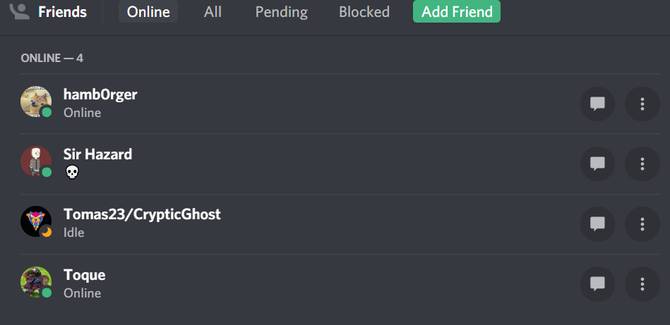
Friends
We would like to implement some kind of a “friends list” using the way Discord displays friends as a starting point.
Other pages that currently do not have mockups:
Find study sessions page
Users can search for current and future study sessions by class.
Leaderboard
Still a WIP, but our “game mechanic” will have some type of ranking system to displays top users.
Messages
Either a private or public message system that will allow users to asks questions and post messages regarding study sessions.
Additional functionality ideas if time permitting
- UH CAS login
- Text messaging
- Geolocation
- Slack integration
- Rating system
Use Cases
Need to establish a set of use cases to use as development guidelines
Milestone 1
Milestone 1 and past progress can be seen by clicking here.
Milestone 2
The goal of Milestone 2 is to improve the functionality, software engineering process, and quality of the application significantly.
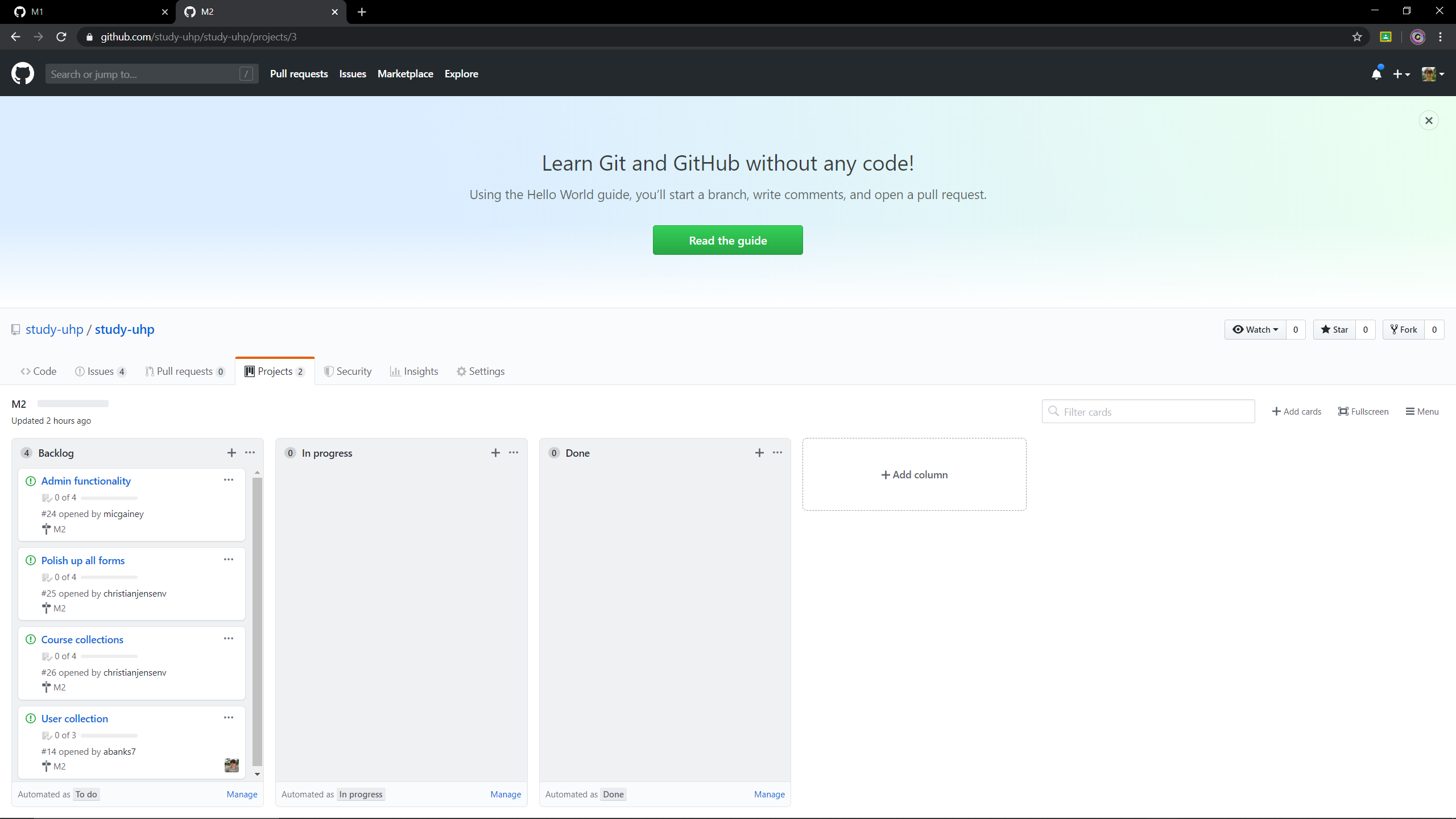
Milestone 2 is being managed with the M2 Project Board
- Admin functionality
- Polish up all forms
- Course collections
- User collections
Current Functionality:
Landing
The first page a user will see when coming to site.
User Sign Up
If a user does not currently have an account they can create one. We ask for some basic information about the user to get their profile started.
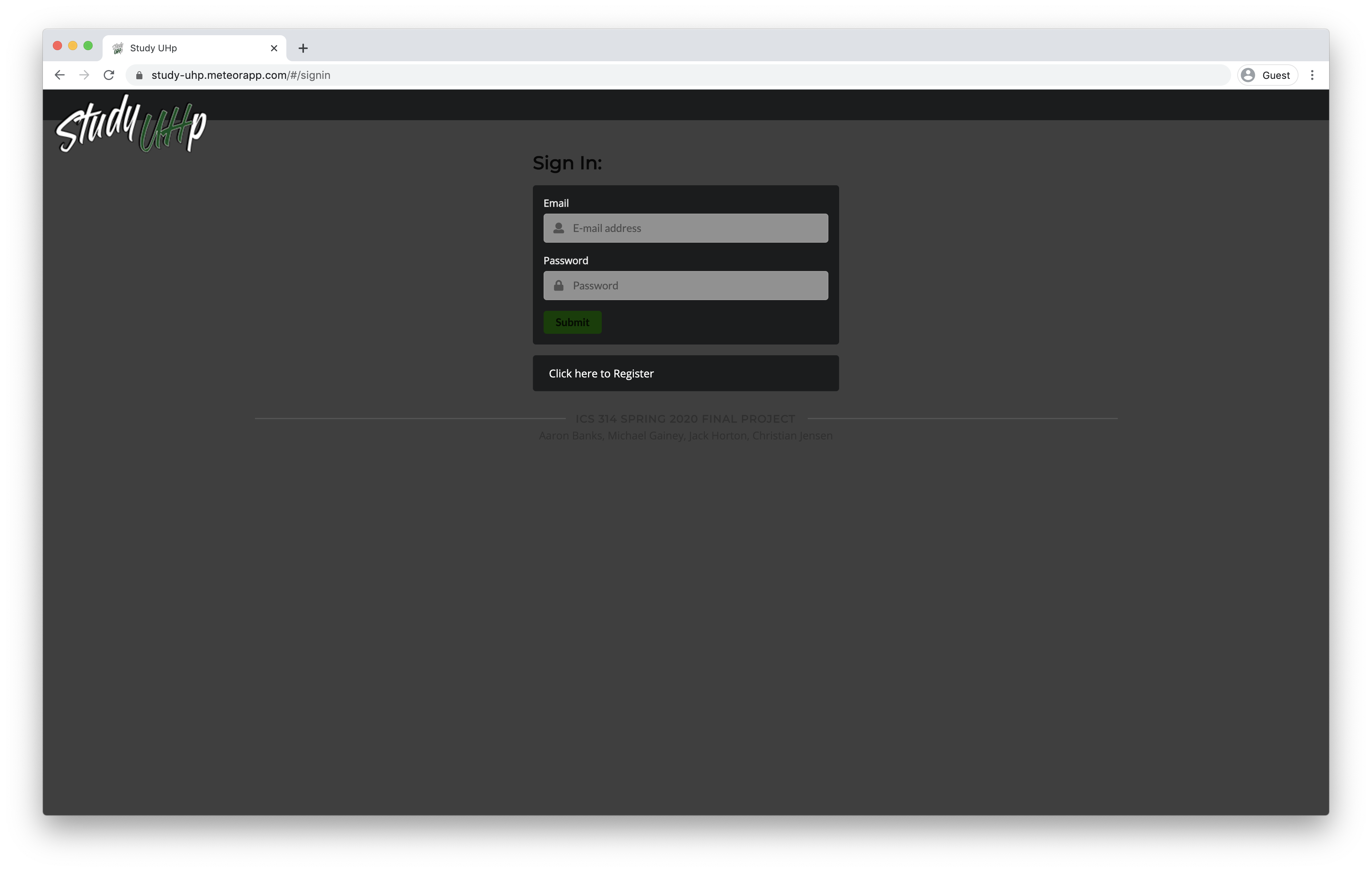
User Sign In
If the user already has an account they can proceed to sign in.
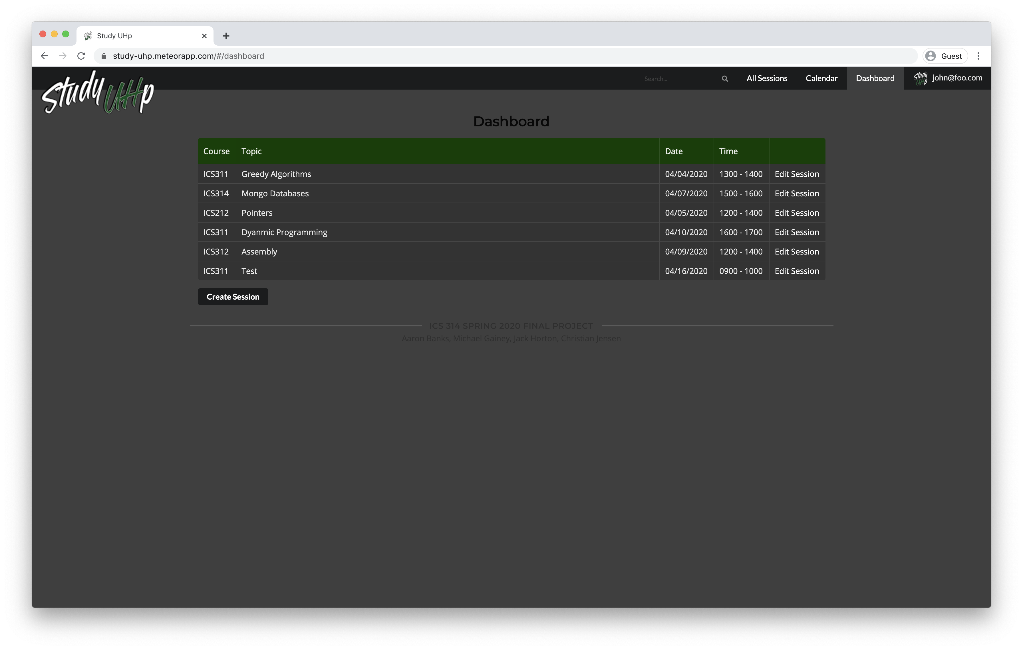
User Dashboard
The first page a user will see after logging in. They will also be directed here if logged in and return to the site or if they click on the logo in the navigation bar.
Study Sessions
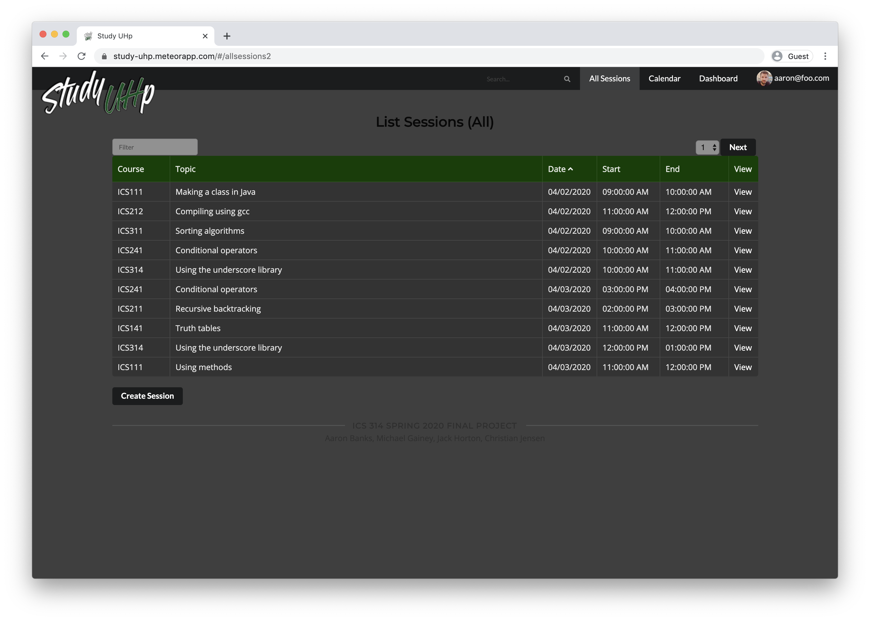
The list of all currently scheduled study sessions. This is only available to logged in users. The “Join Session” functionality is not currently active, but will allow a user to join a study session if there is available space. The “view” link lets a user see more information about a currently scheduled session. A user can sort the list by any of the column headings, and also filter it to find any particular session by any category.
View Session
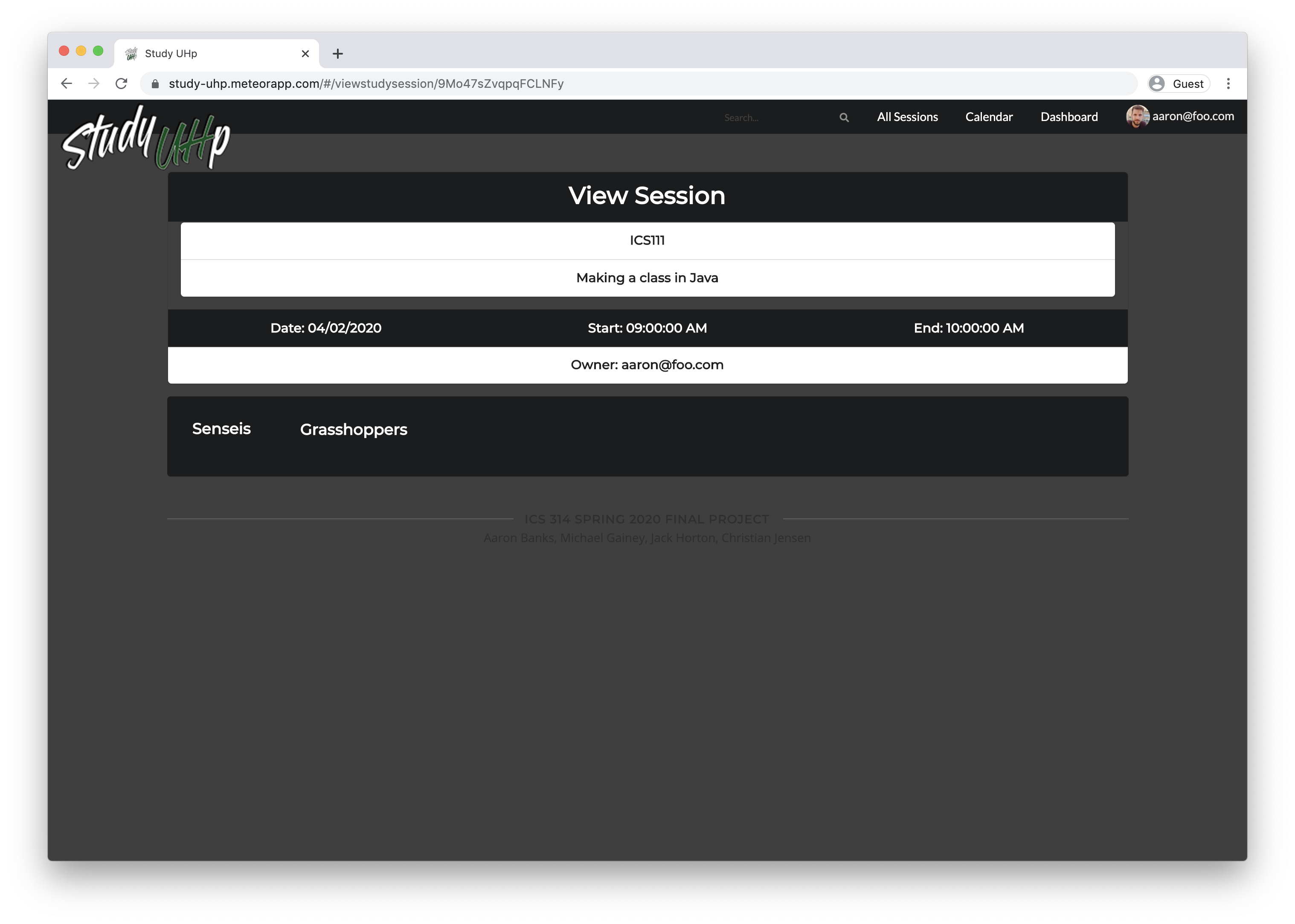
A user can view information about a scheduled session. In the future this will list all the participants and allow a user to join the session.
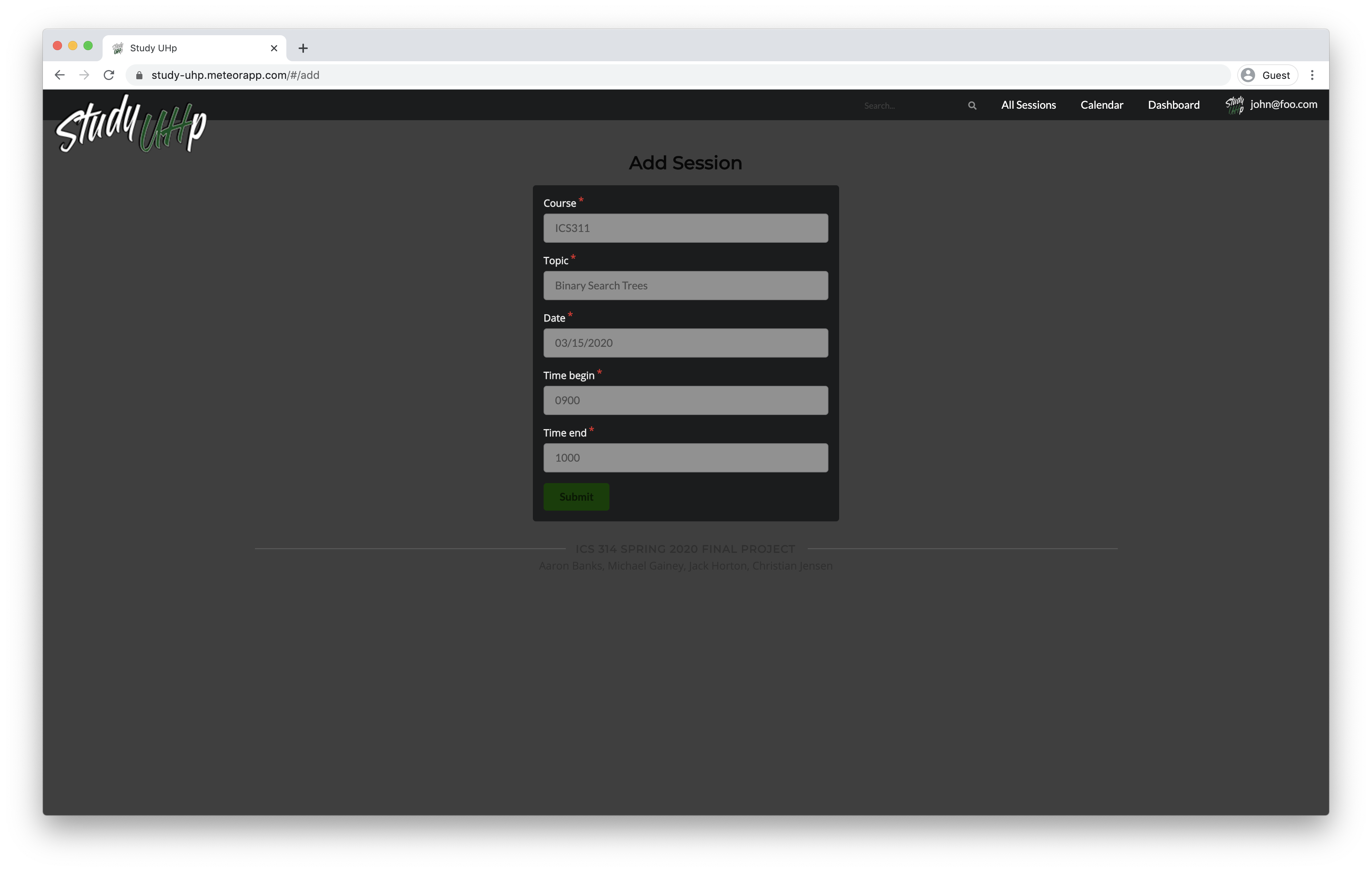
Create A Study Session
A logged in user can create a new study session. Currently only basic options are available, and in the future they will be able to specify more detail and also schedule a session for “Right Now!”
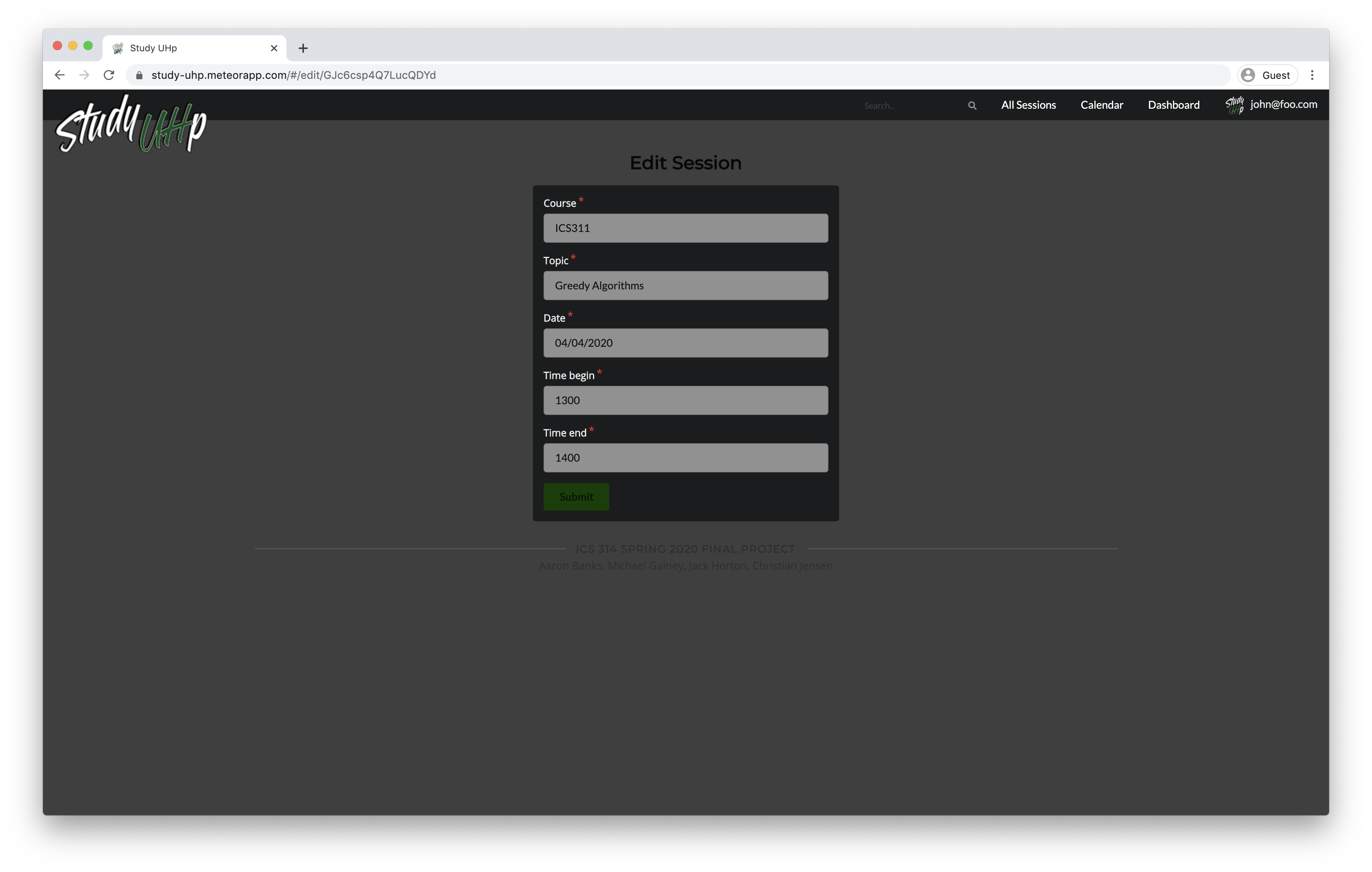
Edit A Study Session
A logged in user can edit a study session only if they are the “owner” of the study session. The same fields available upon creation and available to edit.
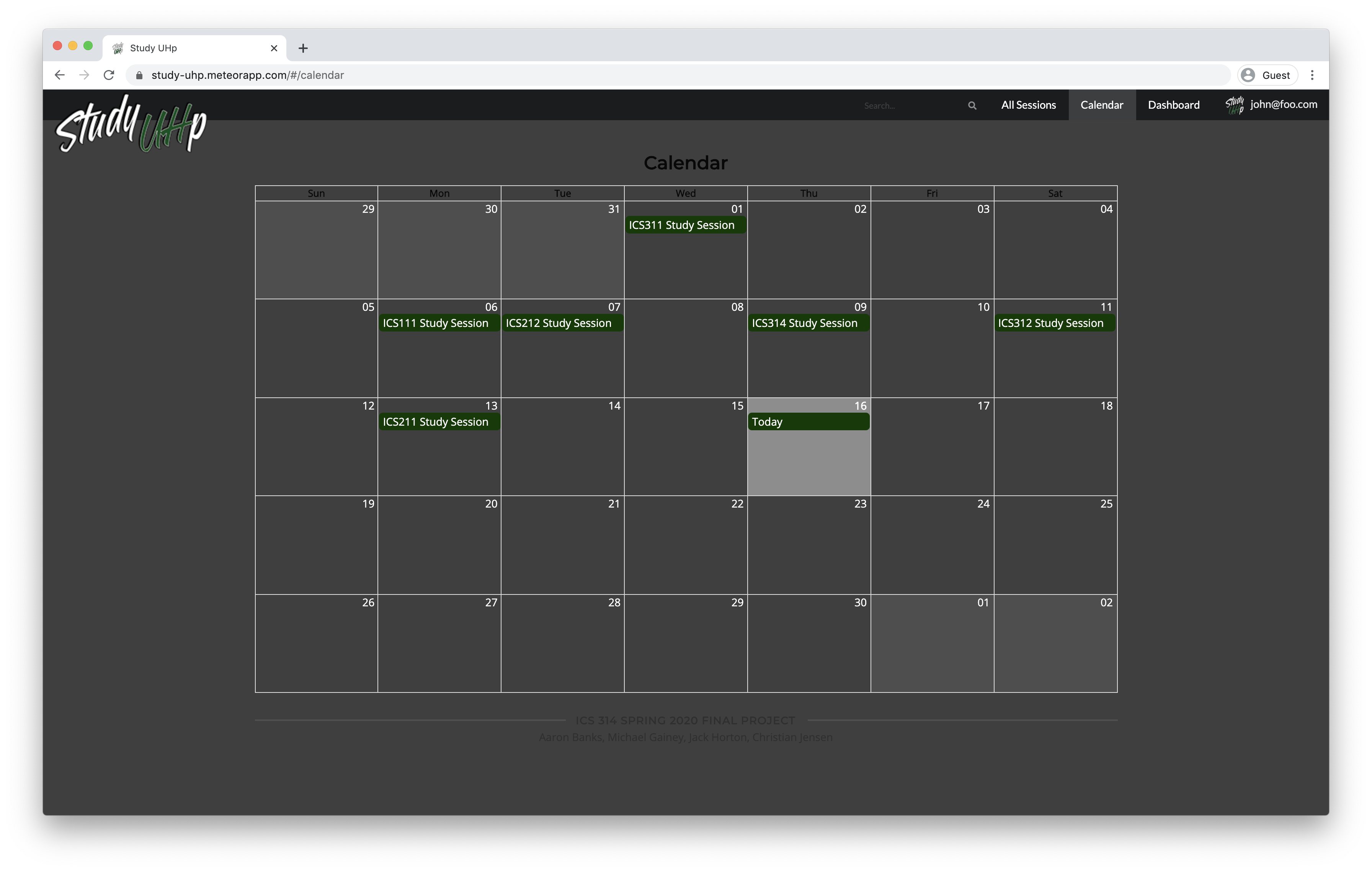
Calendar
Logged in users can view all of the upcoming study sessions in a calendar view.
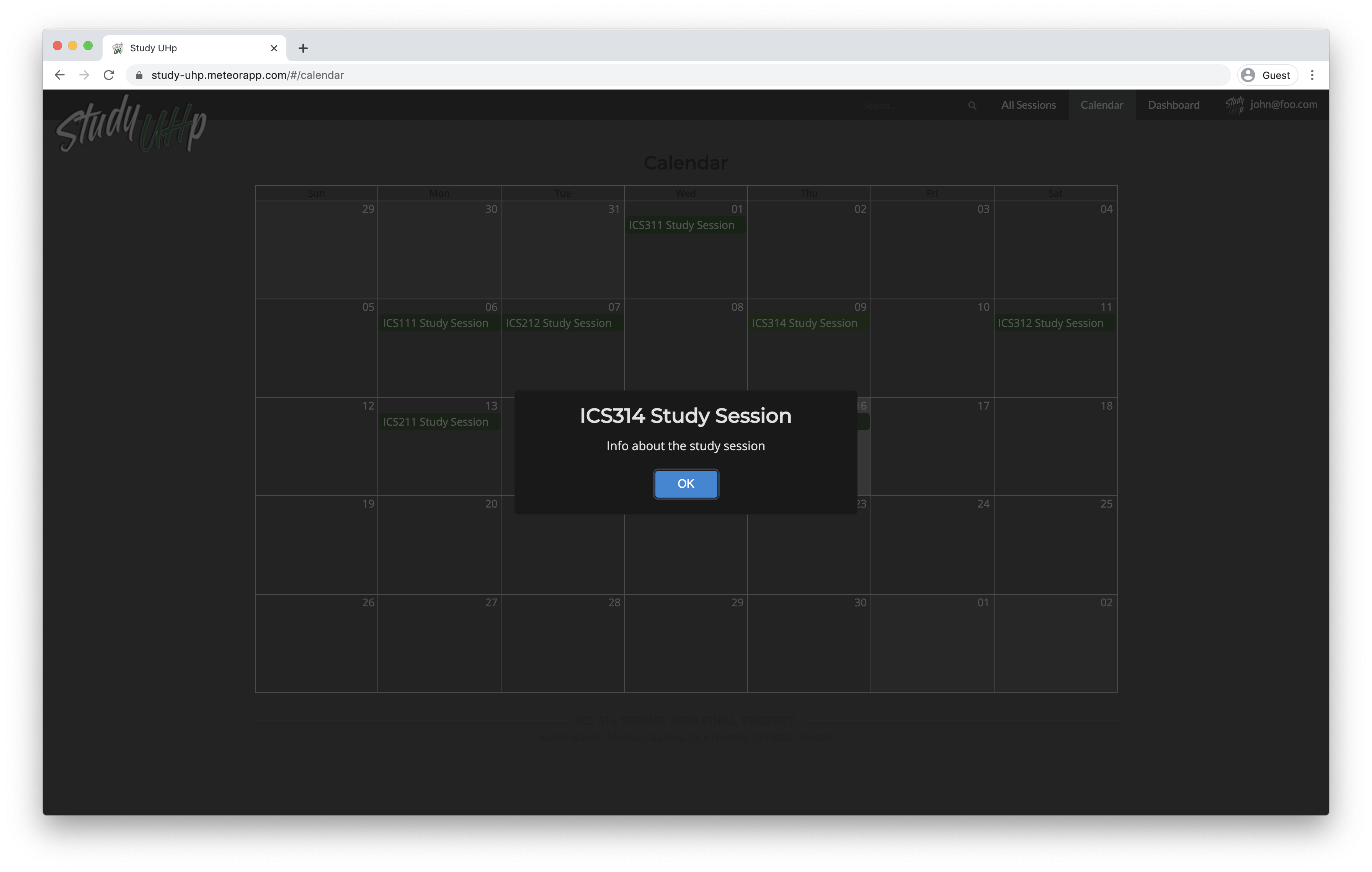
Currently clicking on a session will only provide a modal dialog with placeholder text. In the future a user will be given the option to view details about the session or join it.
User Profile
Currently just a placeholder mockup page. In the future logged in users will be able to see their profile which will include their class listing, bio, profile picture, and rating among other things.
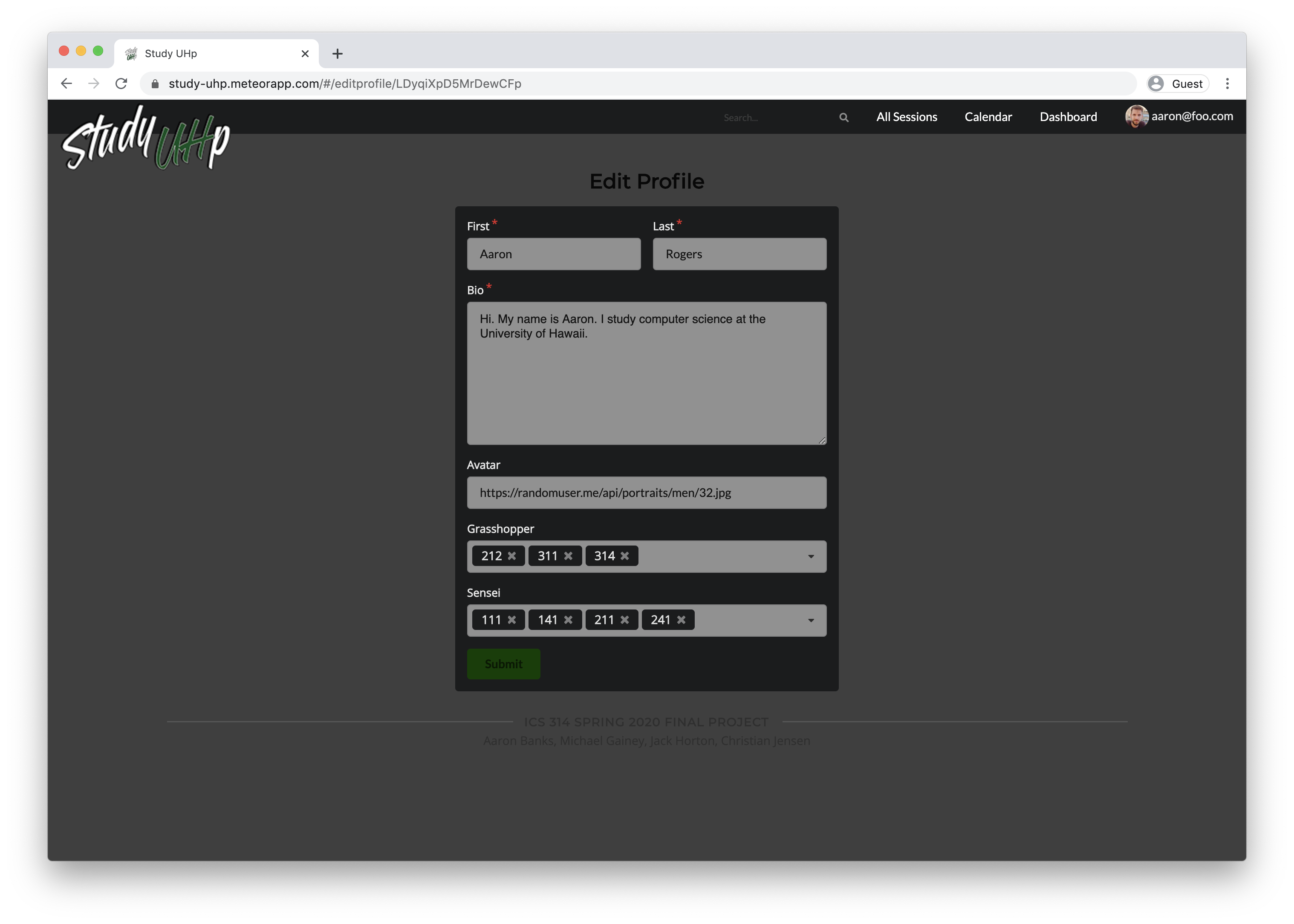
A user can also edit their profile information, including adding and removing classes.
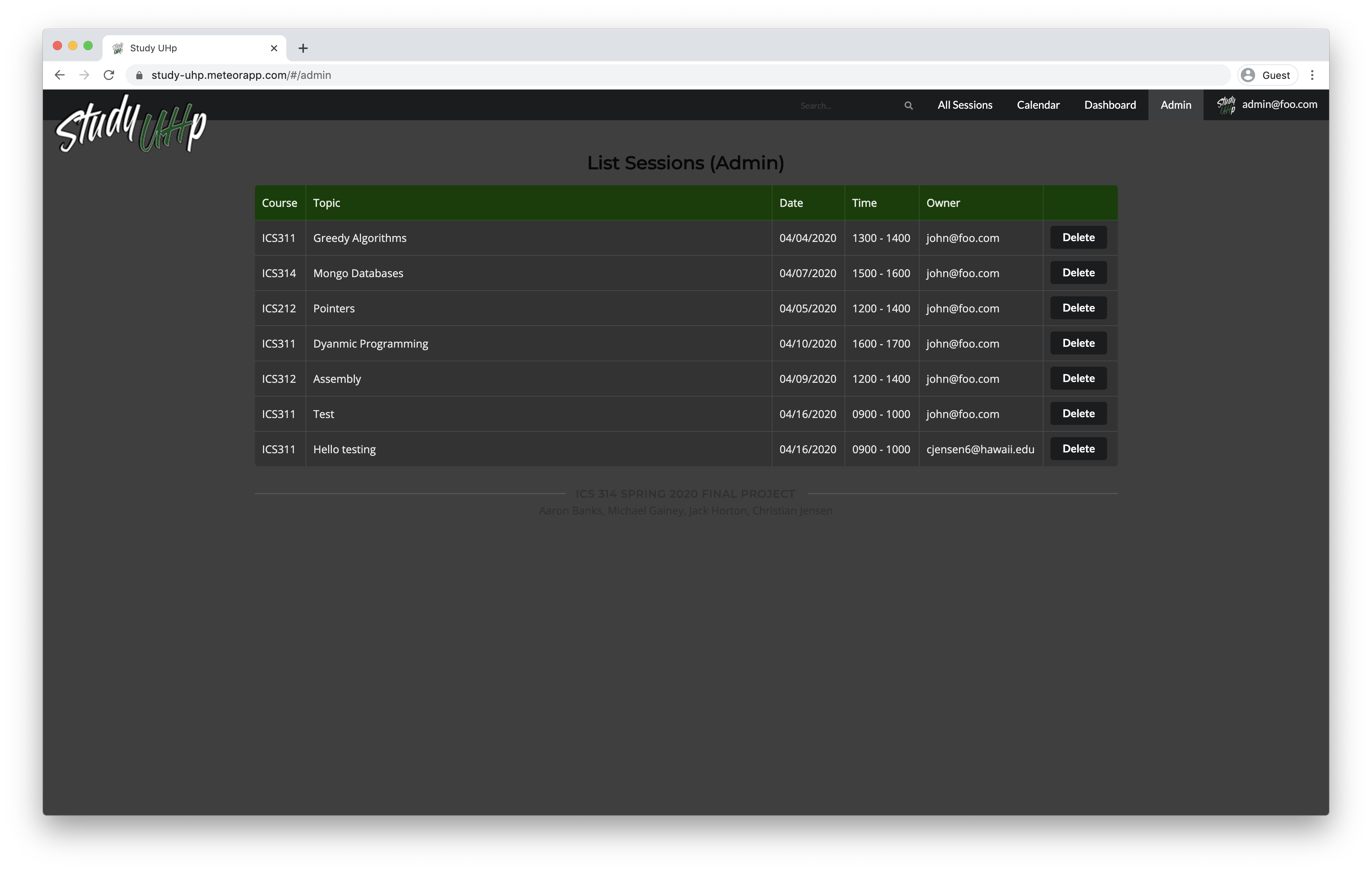
Admin
If a user is logged in with admin permissions they will be able to navigate to a special “Admin” page that will show a listing of all upcoming sessions. Currently the “Delete” button is not functional. In the future an admin user will have various control abilities over sessions and other aspects of the site.
Milestone 3
The goal of Milestone 3 is to significantly improve functionality from Milestone 2, and to find five UH community members to try out the system and provide feedback.
Session tab
In the session tab you can view all the sessions created. You can view up to 10 sessions per page.
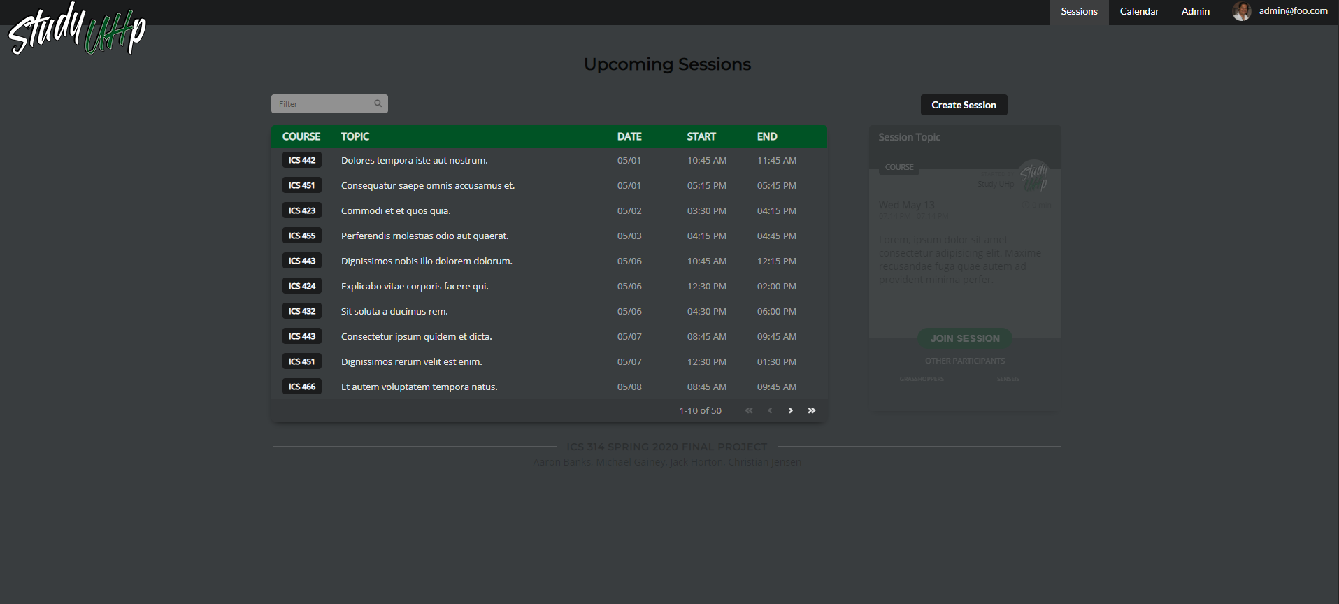
As you can see the session page on the right is grayed out on first load. This will later light up as you click to view other sessions.
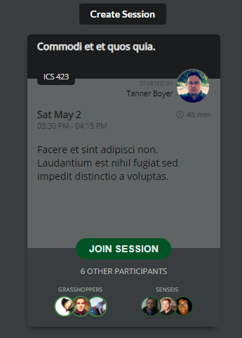
This is the view after clicking on the session, and it will show all the current grasshoppers and senseis in the session. There is also a join session button that will add the user to the list of participants and update the session. After clicking ‘JOIN SESSION’, you will be prompted to choose whether you want to join as a grasshopper or a sensei.
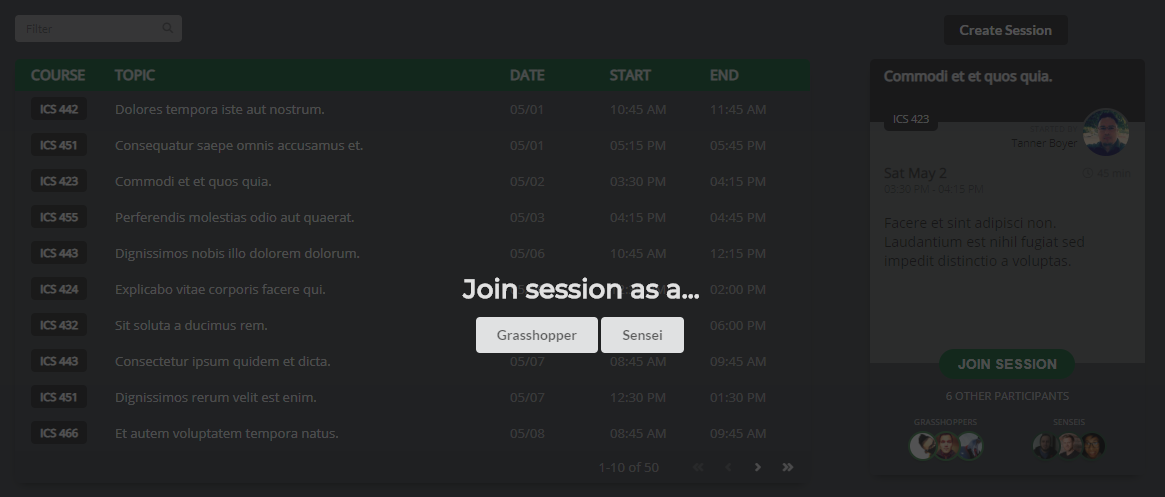
Here you can choose which role you will be placed in on the session.
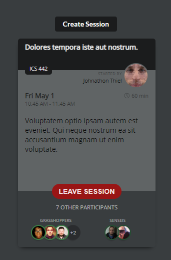
As you can see above, after joining the session you will be given the option to leave the session.
Calendar
With the new calendar page, it will reflect the sessions made and update itself when a new session is made. In the calendar it will show all the sessions held on that day.
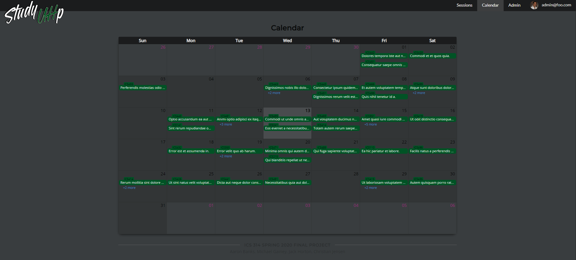
You can access any of the sessions on the calendar by clicking on one of the green tabs.
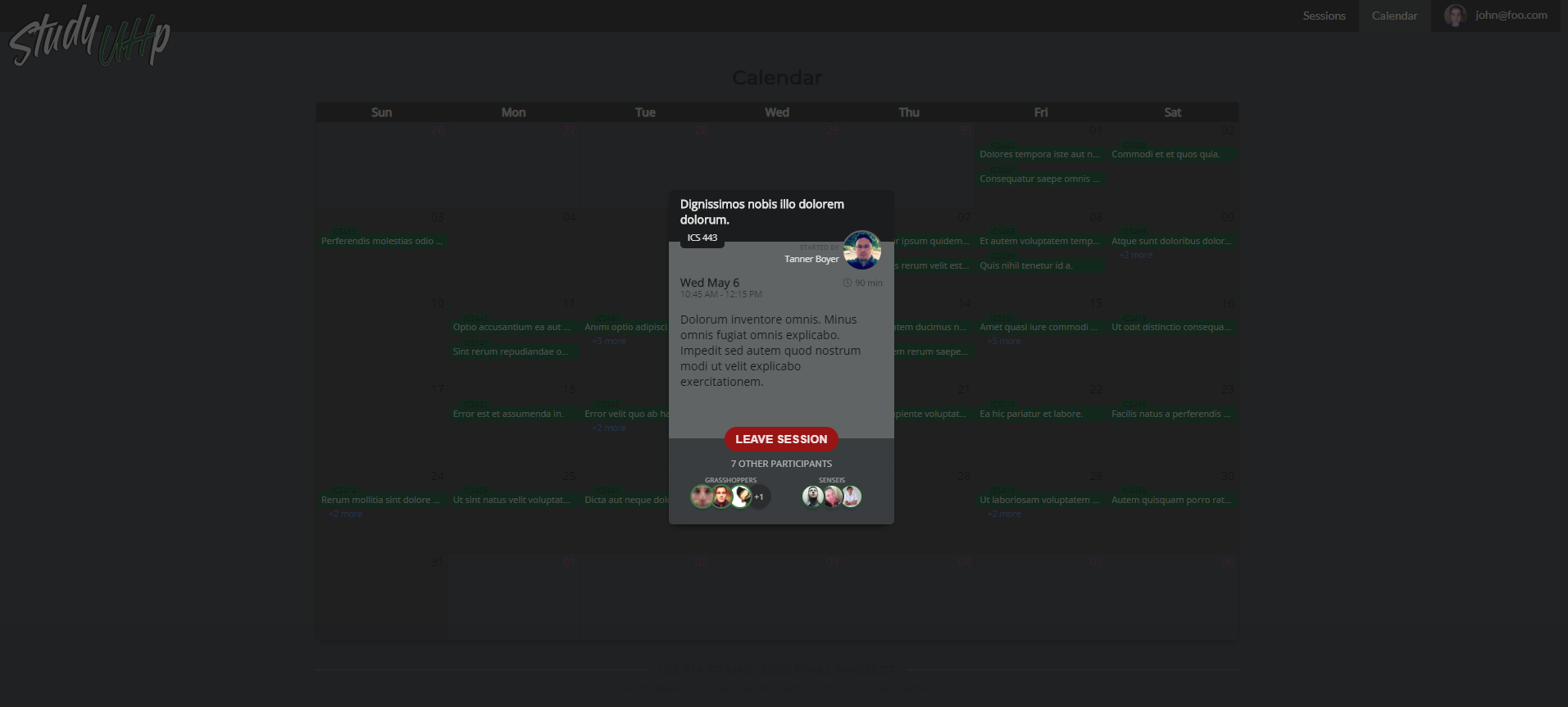
Here you can view, or join any session just like on the session page.
Developer Guide
This section provides information of interest to Meteor developers wishing to use this code base as a basis for their own development tasks.
Installation
First, install Meteor.
Second, visit the Study-UHp application github page, and download the sources as a zip file or make a fork of the repo. However you do it, download a copy of the repo to your local computer.
Third, cd into the study-uhp/app directory and install libraries with:
$ meteor npm install
Fourth, run the system with:
$ meteor npm run start
If all goes well, the application will appear at http://localhost:3000.
Application Design
Study UHp is based upon meteor-application-template-react and meteor-example-form-react. Please use the videos and documentation at those sites to better acquaint yourself with the basic application design and form processing in Study UHp.
Initialization
The config directory is intended to hold settings files. The repository contains one file: config/settings.development.json.
This file contains default definitions for Users, Profiles, and Sessions and the relationships between them. Consult the walkthrough video for more details.
The settings.development.json file contains a field called “loadAssetsFile”. It is set to true, but if you change it to false, then the data in the file app/private/data.json will not be loaded. The code to do this illustrates how to initialize a system when the initial data exceeds the size limitations for the settings file.
Quality Assurance
ESLint
Study UHp includes a .eslintrc file to define the coding style adhered to in this application. You can invoke ESLint from the command line as follows:
meteor npm run lint
Community Feedback
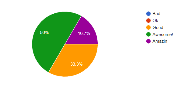
How does the site look?
What’s your favorite thing about the web app? Why?
- The landing page, high quality work. The image follows mouse!!!! OP
- The fact that it makes it easier to study with friends
- Site is responsive and is not cluttered. For these two things to go wrong may make the user feel confused or exit the website.
- The buttons and effort to implement the overall data.
- My favorite thing about the web app is how accessible it is. It is easy to create, join, and leave sessions. I can filter and sort the sessions by class and I can see (most of) the upcoming sessions on the calendar.
- I like the color scheme and graphic design, it pleases me visually
Least favorite? Why?
- Unfinished sorta, but still functions and looks cool!
- The interactivity, it should list all participants if you hover over their icons when selecting a session.
- When user first gets in, right side is greyed out and makes it appear broken or as if part of the site is down. Until a topic is selected, the right side is ‘lit up’ and then feels like it should be there.
- Submitting data didn’t function and breaks.
- I am not a huge fan of the appearance of the app. Everything is very organized and the login screen is visually appealing, but I’m not sure that everyone likes dark mode.
- The Latin kinda threw me off. It seems like it doesn’t make a difference but it made the difference between knowing what the site was for instantly and having to probe around for a bit to understand it was a tutoring site.
Would you use an app such as this one? If so why?
- Yes, it has functionality to helping students getting tutored overall.
- Yes if I was trying to find study partners.
- Yes, everything seems organized and can help visualize workflow.
- Yes, it has the function to be a really good choice for tutoring.
- I would use an app such as this one. In terms of the web app, it is straightforward and organized. In terms of the concept, as a previous Elementary Education major/new Hawaiian Studies major, I don’t think we necessarily get stuck on assignments and require help from others much (compared to like building a site). However, in the following questions, I explain how this can be applied to other majors outside of ICS.
- Sure, it seems easy to use
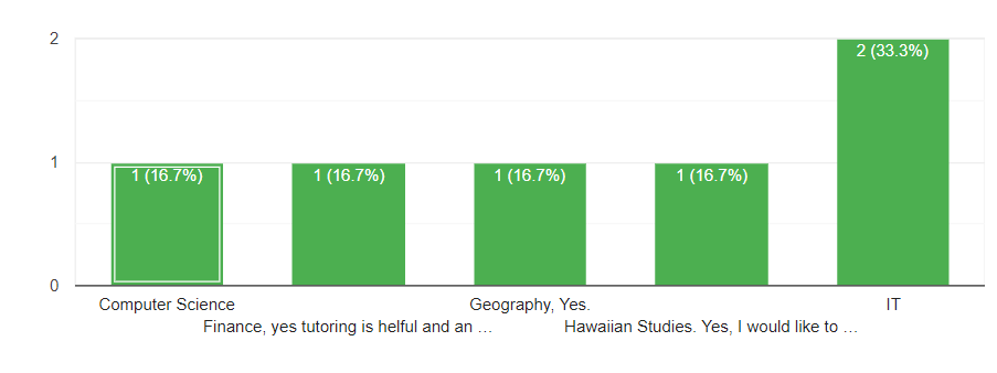
What is your major? If not computer science, would you like to see this web app for your major?
Would you like the see this site or something similar implemented for UH?
- Yes, it will help students learn and overall benefit.
- Definitely, would make it easier to connect with classmates
- Yes.
- Yes, it would serve to be really good for students.
- I think this would be a great site for students who need tutoring or support from other students in their majors (ex: the Learning Emporium). It can potentially provide students with the opportunity/incentive to help and work with people they don’t know.
- With UH owning and running it? absolutely not they make everything a headache. But if it was separately owned and used as a resource then absolutely.
How is it compared to other websites you use and how does it compare to those in the UH system?
- It is very similar formatting and will work towards.
- Less intuitive than other UH websites(barely), has potential to be very useful though.
- Laulima has a calendar function, but most Laulima sites don’t use them. Laulima even has discussion/assignment sections which could really be merged into one using the format this site has.
- It has the functionality to be a huge benefit for students.
- I think it is a lot more straightforward and organized in comparison to other websites (including those in the UH system). There isn’t an overwhelming amount of information and completing tasks (ex: creating session) is a simple process.
- It seems to stand well along other normal websites. It is more intuitive than most UH websites.
Any suggestions to improve the web app?
- Finish the website
- More interactivity, hover over user icons for their information, see a user list in each session, etc.
- Color choice is somewhat subpar. Grey on grey doesn’t contrast well and if white is used in the upper left logo, white should be used more throughout the website too.
- Finish the submit data function, and try to implement the display feature.
- Sessions: shouldn’t have to scroll to the right for sessions, can also just display all sessions on one page similar to UH Course Availability Calendar: include what month it is, display all times and sessions (like Mac Calendar - you can see all of the events and what time they start), perhaps add a feature so that you can see the sessions for just this week, add option to create sessions on this page Appearance: could be more visually appealing and welcoming (rather than dark mode), initially it is not really obvious that this an app for ICS students (aside from mentioning ICSpace as you read further on the homepage) Misc: provide contact info at the bottom of the page for questions/concerns, automatic refresh to the homepage when logging out, page for instructions in terms of explaining like what it means to be a grasshopper and sensei
- Improve usability on mobile
Any noticeable bugs and/or flaws?
- Submitting data and questions are a little weird
- None that I can see
- Spacing is weird on profile page. I can’t tell if its supposed to be a one card with an attachment type of deal or if the spacing is off.
- The page index box doesn’t scroll with the horizontal scroll box.
- Spelling and function of database
- Sign Up and a lot of features not working/accessible. The language of the session topics is Latin(?). Some features not yet completed.
- Mobile browsers have trouble with sign in/up buttons
Any additional comments?
- Looks amazing, i would like to see it implemented for the schools.
- N/A
- Overall, still a good webpage and looks like it’ll get the job done.
- Site looks good and has function to be a good site for students
- N/A
- N/A
User guide
When you the user first gets onto the site, you will be greeted with our logo and signin/signup buttons.
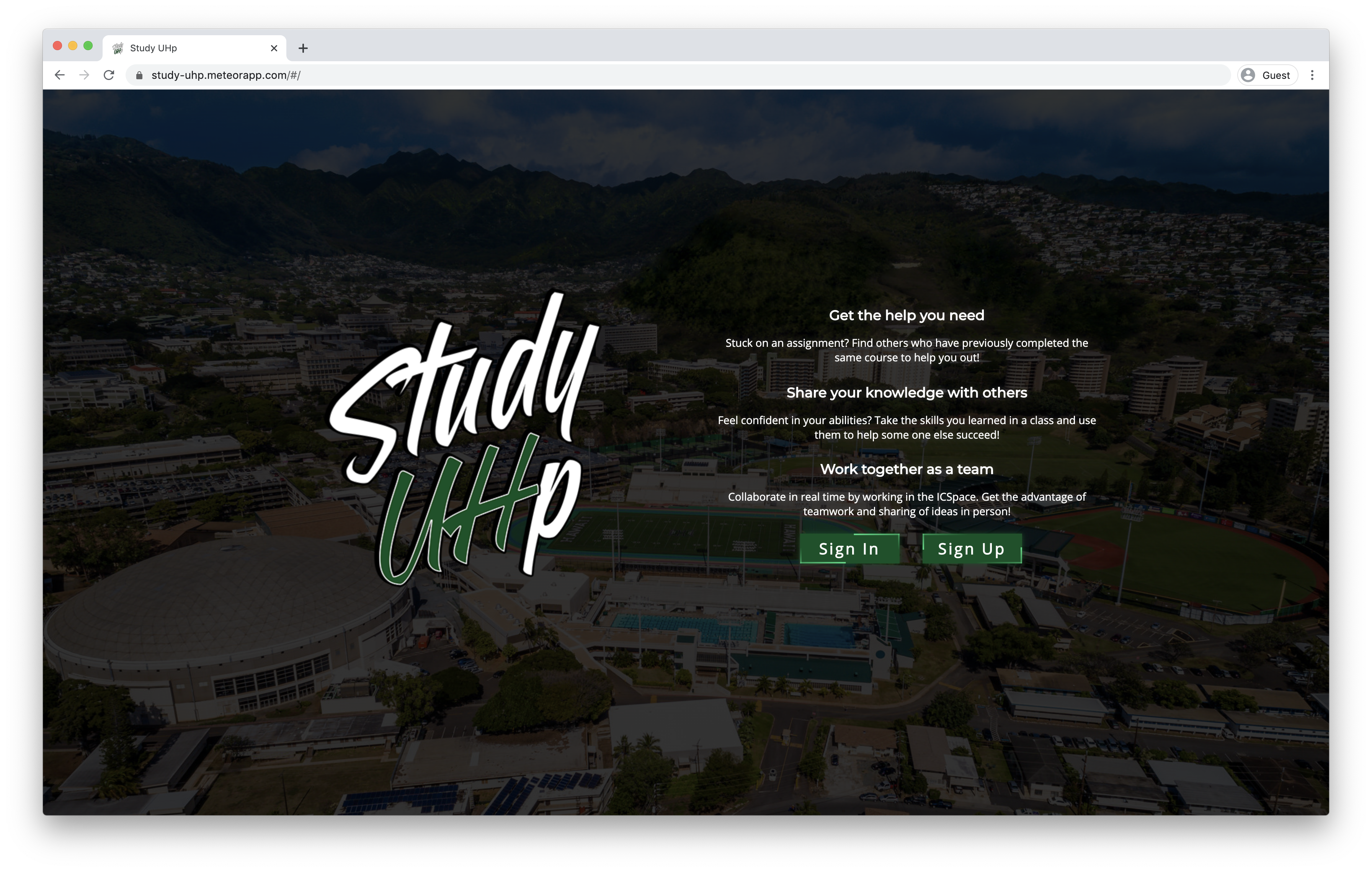
The text will show you what our webapp can do for you and what the webapp will be used for. After clicking signup, you will be led to the signup page.
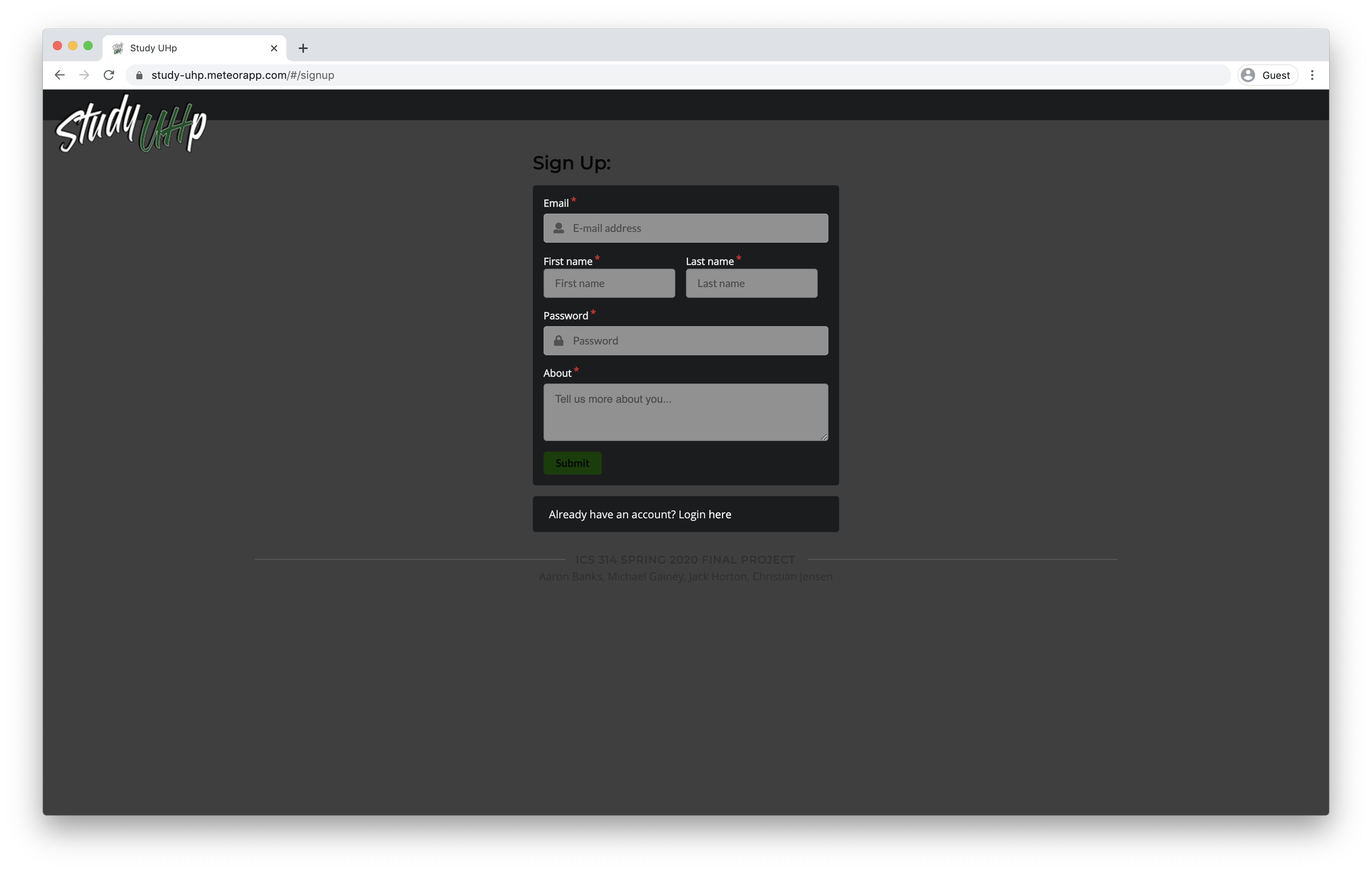
You will be asked to enter your email, first name, last name, and a little about yourself.
After going through the prompt you will be taken to the sessions tab.

You can view all of the current sessions, but before going through that lets go to the edit profile page. You can get here by clicking in the corner on your email and clicking on profile.
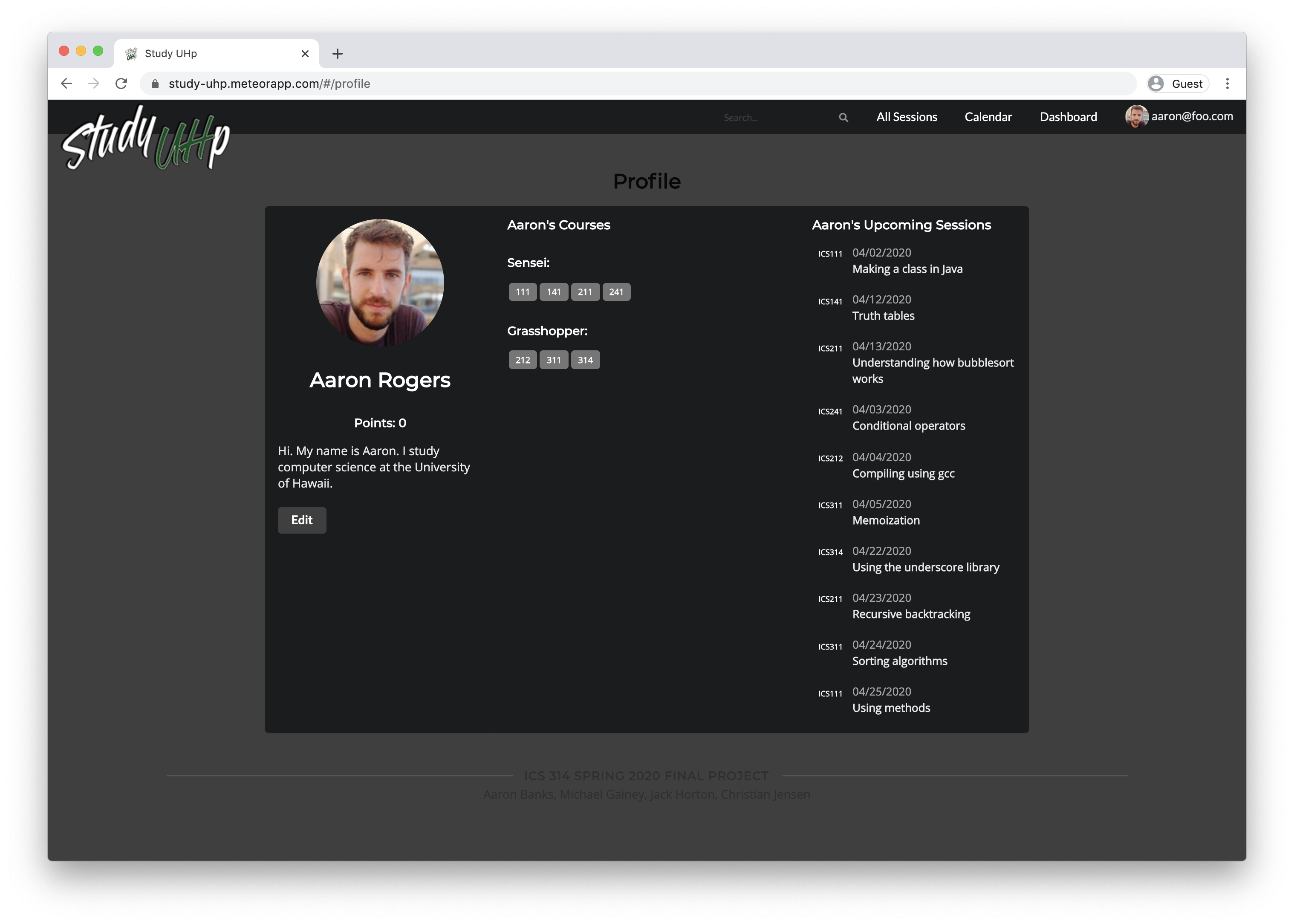
Here you will be given the option to add classes you’re good at in the Sensei’s list or classes you might need help with in the grasshopper’s list. The profile will also show you the current sessions that you joined.
As you can see there are a points system, the points system is supposed to be a game, where you earn points by tutoring people in classes that you’re good at. The score will reset every week and give you points based on how many people you helped.
Now lets get back to the sessions tab.

Here you can look at all the sessions that were made. To view the session in more detail look on the right side. Right now it is greyed out but when you click on any session it will light up.

You can see all of the details of the session here. It will inculde the person that started the session, the duration of the session, the topic you will be working on, who the participants are, and finally when the session will be held.
To join the session simply click the JOIN SESSION button!

Here you will need to choose whether you would like to join as a grasshopper(tutored), or the sensei(tutor). After clicking on one of the options, the session will reflect your decision.

Now that we have the sessions tab out of the way we can move onto the calendar tab. Here you will have most of the functionality from the sessions but in a different view.

As you can see, you can view all the sessions for the month in an easy to read calendar. Here you can also choose to view a session by clicking on any of the green tabs.

It will then bring you to the session that you clicked on, and here you may also choose to join a session.
Our webapp was designed to encourage ICS students to use ICSpace and help students find people to study with/get help.
